Tuesday, 3 August 2010
The originals
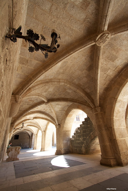
As requested by Mark, and his post on Helmsley Castle .here are the original shots from the Palace of the Grand Masters. As Adrian rightly pointed out, blown highlights do look pretty naff in a colour photo. I had thought about getting the tripod out and shooting some bracketed shots for HDR but always intended to convert these to b&w so decided against it. I rather like the shape the sunlight leaves as it shines over the steps.
I use both apple's Aperture and Photoshop for processing. Using a Mac, Aperture is an obvious choice and has some great features with a really straight forward library system. It is however lacking many of the features that even Photoshop elements throws in.
Anyway these 2 images were both edited in Aperture. First things first, goodbye to the people sitting on the bench. Used the clone brush to erase them from the scene.
Secondly was to reduce chromatic aberration which seams to be the plague of modern wide angle lenses. Not sure it makes much difference when converting to black and white but I just do it out of habit these days.
Next was black and white conversion. I left the colour balances as they were from the conversion. Aperture gives you a choice of red, green and blue which is a fraction of what Photoshop offers.
Next was the boost in contrast. Ordinarily I steer clear of too much contrast adjustment in colour pictures but b&w can be pushed with excellent results.
One great feature of Aperture is the definition slider. It brings out the details without adding to the contrast. It's probably the main reason I used Aperture over Photoshop this time as it quickly does what might take several steps in PS and really boosts the detail in the stonework.
Lastly was some dodging and burning. I used the burn brush to darken round the blown out highlights and bring back lost detail from the increase in contrast. Also round the edges to add some drama and draw the eye into the centre of the image. Then used the dodge brush to lighten some of the ceiling areas and in particularly the lamp holder in the portrait image as this had lost all detail.
And that's the finished article. 2 reasonable shots for not too much processing.
Subscribe to:
Post Comments (Atom)


Thank you for this process breakdown. I hardly ever use the dodge and burn tools on images - but recently discovered them as a way of highlighting parts of a series of screenshot images I took for demonstrating making movies step by step. I faded the entire image and then brought certain parts back. Then wrote instructions and arrows all over the faded bits.
ReplyDeleteI shall have a play with dodge and burn more from now on.
Still grand images in colour. It's lens distortion I find a problem. I used to use the remove lens distortion filter but it's a pain. Now I usually get away with merging visible, ctrl+shift+alt +E------Free transform---Ctrl+T. then if you hold ctrl and grab a corner handle you can pull verticals vertical if you do the same but grab a middle handle whilst also holding alt the image grows from the centre out. Cunning and clever are the folk at Adobe.
ReplyDeleteWonderful shots and really great B&W!! :)
ReplyDeleteThanks! You're right though, they are defiantly better in b&w but nice to know the process you took.
ReplyDeleteI must start looking at dodge/burn as they are something I've never really tried before. I've used the clone tool many times to remove things and used contrast etc. to add detail to the whole photo but I've never really thought about working on small details like that.
I think that I could do with some lessons when you get home!!
ReplyDelete