Saturday, 28 August 2010
Jaume Plensa round 2
Labels:
Antibes,
France,
Jaume Plensa,
Sculpture
Wednesday, 25 August 2010
Jaume Plensa
Over the winter this sculpture by Spanish artist Jaume Plensa appeared on the newly refurbished battlements by the quay in Antibes. It's a fantastic structure which I've been admiring and wanting to photograph all summer.
Canon 7D
Canon 10-22mm lens @18mm
ISO200, f11, 1/250
I've been waiting 2 months to be around when the moon was full and get a shot with the sculpture lit up and when it's at its most impressive.
Canon 7D
Canon 18-135 lens @18mm
ISO100, f5.6, 5sec, Canon speedlight +2ev exposure comp.
While I was waiting I got a couple of shots of this yacht in the moonlight which I quite like.
Canon 7D
Canon 18-135 lens @100mm
ISO100, f6.3, 1/80
Canon 7D
Canon 18-135 lens @ 47mm
ISO100, f8.0, 8sec
Canon 7D
Canon 10-22mm lens @18mm
ISO200, f11, 1/250
I've been waiting 2 months to be around when the moon was full and get a shot with the sculpture lit up and when it's at its most impressive.
Canon 7D
Canon 18-135 lens @18mm
ISO100, f5.6, 5sec, Canon speedlight +2ev exposure comp.
While I was waiting I got a couple of shots of this yacht in the moonlight which I quite like.
Canon 7D
Canon 18-135 lens @100mm
ISO100, f6.3, 1/80
Canon 7D
Canon 18-135 lens @ 47mm
ISO100, f8.0, 8sec
Labels:
Antibes,
Jaume Plensa,
Moon,
Sculpture,
Yacht
Friday, 20 August 2010
Malta
On a recent visit to Malta a few of us paid homage to the late great Oliver Reed by paying a visit to "The Pub" where he had his last drinks (I believe they were many), had a little snooze in the corner, which was a fairly regular occurrence and never woke up. As a tribute we had several pints in his honor. He died during the filming of the movie Gladiator which had to be completed by a double and his head was added to the figure by CGI.
The old town of Malta has some fantastic architecture. I'd love to be able to tell you more about this building but being a Sunday everything was closed.
This is one of the many old buses that run around the island. I didn't get a chance to photograph any more unfortunately but hopefully will be there again soon to record these fantastic machines before they disappear. Malta's entry to the EU will unfortunately be the demise of beautiful old vehicles such as these but to be fair when you stand beside one and it belches black smoke at you you can understand the legislation.
The attention to detail on these buses is exquisite. Union Jack a funny touch considering this is one of the very few buses that's not actually British on the island. Most are old Bedfords and Leylands.
Labels:
Bus,
Malta,
Oliver Reed,
The Pub
Sunday, 8 August 2010
Corinth Canal
The Saronic Gulf or Gulf of Aegina entrance
Midway throughA tight squeeze!! Picture courtesy of Nathan Ward, Chief Engineer
All these years at sea and I still only had one of the big canals under my belt, the Panama. It is the biggest though and quite an experience.
Recently we sailed through the Corinth Canal, connecting the Gulf of Corinth and the Saronic Gulf. Quite a feet of engineering in its day. The idea was conceived as far back as the 7th century BC by the tyrant Periander who instead built an overland passage for ships. Construction of the canal wasn't actually completed until 1893.
At 21m wide it's far too narrow for most modern vessels and even our boat takes up more than half the width. The 52m high walls are spectacular especially set against the contrasting azure colour of the water.
Suez here I come!!
Tuesday, 3 August 2010
The originals
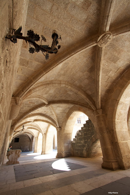
As requested by Mark, and his post on Helmsley Castle .here are the original shots from the Palace of the Grand Masters. As Adrian rightly pointed out, blown highlights do look pretty naff in a colour photo. I had thought about getting the tripod out and shooting some bracketed shots for HDR but always intended to convert these to b&w so decided against it. I rather like the shape the sunlight leaves as it shines over the steps.
I use both apple's Aperture and Photoshop for processing. Using a Mac, Aperture is an obvious choice and has some great features with a really straight forward library system. It is however lacking many of the features that even Photoshop elements throws in.
Anyway these 2 images were both edited in Aperture. First things first, goodbye to the people sitting on the bench. Used the clone brush to erase them from the scene.
Secondly was to reduce chromatic aberration which seams to be the plague of modern wide angle lenses. Not sure it makes much difference when converting to black and white but I just do it out of habit these days.
Next was black and white conversion. I left the colour balances as they were from the conversion. Aperture gives you a choice of red, green and blue which is a fraction of what Photoshop offers.
Next was the boost in contrast. Ordinarily I steer clear of too much contrast adjustment in colour pictures but b&w can be pushed with excellent results.
One great feature of Aperture is the definition slider. It brings out the details without adding to the contrast. It's probably the main reason I used Aperture over Photoshop this time as it quickly does what might take several steps in PS and really boosts the detail in the stonework.
Lastly was some dodging and burning. I used the burn brush to darken round the blown out highlights and bring back lost detail from the increase in contrast. Also round the edges to add some drama and draw the eye into the centre of the image. Then used the dodge brush to lighten some of the ceiling areas and in particularly the lamp holder in the portrait image as this had lost all detail.
And that's the finished article. 2 reasonable shots for not too much processing.
Subscribe to:
Comments (Atom)


